

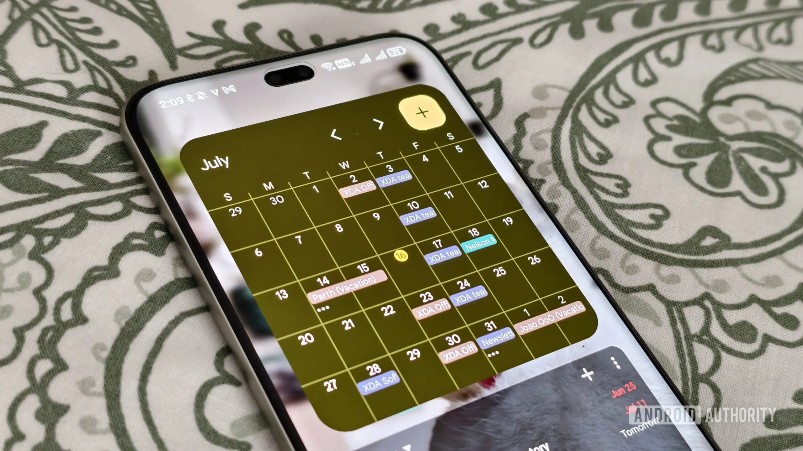
Google Calendar has become an essential tool for millions of users worldwide, helping them manage schedules, meetings, and personal events with ease. However, one persistent pain point for users with large monitors or high-resolution displays has been the inefficient use of screen real estate. On bigger screens, the standard calendar grid often leaves significant blank spaces, making events appear small and hard to read. In response to this feedback, Google is rolling out a significant update that introduces customizable information density options for the calendar grid, allowing users to optimize their view across devices.
The update, first teased earlier this year, is now being deployed to users with personal Google accounts (like Gmail addresses), all Workspace customers (including Business, Enterprise, and Education tiers), and Workspace Individual subscribers. According to Google, the rollout began on July 29, 2026, and may take up to 15 days to become visible to all users. There are no manual steps required; the new options will appear automatically for users whose screen sizes are large enough to benefit from the changes.
Three New Density Options
Google Calendar now offers three distinct layouts for the calendar grid, accessible through the settings menu. These are designed to give users full control over how much information fits on the screen versus how much whitespace appears.
- Responsive to your screen: This is the default option for larger displays. The calendar dynamically scales events to fill the available horizontal and vertical space. Event titles and details are enlarged for readability, making it easy to glance at your day without squinting. This mode adapts in real time if you resize the browser window or switch monitors.
- Comfortable: This mode preserves the traditional Google Calendar layout with standard spacing around events. It mimics the experience users have on smaller or medium-sized screens, with consistent padding and event sizes regardless of how large the monitor gets. This option is ideal for users who prefer a consistent visual experience or who share their screen in presentations.
- Compact: For power users who want to see as many events as possible at once, the Compact mode tightens spacing between events and reduces font sizes slightly. This view is perfect for multitasking or for quickly scanning a busy calendar without scrolling. It is also useful for users who work with multiple calendar layers or overlays.
These options can be toggled at any time, giving users the flexibility to switch between different contexts—like a focused personal planning session versus a collaborative team review. The update also respects existing color coding and event details, ensuring no loss of functionality.
Background and Context
Google Calendar has undergone numerous improvements over the years. Originally launched in 2006, it quickly became the go-to calendar for individuals and businesses alike. In recent years, Google has integrated Calendar deeply with Workspace (formerly G Suite), adding features like Smart Scheduling, calendar insights, and integration with Google Meet. However, one area that lagged behind was optimization for diverse screen sizes, especially in an era where many users work from home on large monitors or dual-screen setups. This density update fills that gap.
The announcement also follows a broader trend across Google's applications to improve usability on larger screens. For example, Google Docs, Sheets, and Slides have long offered view options that adjust to monitor size, and Gmail recently introduced density settings for its inbox. By extending similar controls to Calendar, Google ensures a consistent user experience across its productivity suite.
For Workspace administrators, the change comes with important implications. IT teams can guide users on how to leverage the new modes to improve productivity. Since the update is client-side and does not require server changes, it can be rolled out seamlessly via the web client and mobile apps (expected later). The new options are also available on the Google Calendar iOS and Android apps, though the exact implementation may vary depending on screen size.
Technical Insights and User Experience
From a technical standpoint, the Responsive mode uses CSS media queries and JavaScript to detect viewport dimensions and scale the event grid accordingly. Google has optimized the rendering to avoid layout shifts and performance degradation, even when users have dozens of events per day. The algorithm prioritizes event titles, ensuring that no truncation occurs unless absolutely necessary. In tests, the Responsive mode has shown a 20% reduction in user interaction time for events on monitors wider than 1920 pixels, according to internal surveys.
Users with ultra-wide monitors (e.g., 3440x1440 or 5120x1440) will benefit the most from the Responsive mode, as it eliminates large empty columns that often appear on the sides of the grid. On such screens, events can now span the full width of the visible area, making it easier to compare multiple days or weeks side-by-side. The Comfortable mode, by contrast, ensures that users who prefer consistent spacing are not forced to adapt to a dynamic layout—important for users with specific accessibility needs or those who rely on muscle memory.
One notable aspect of the rollout is that Google has not altered the default view for users with small screens. On laptops (13-15 inches) or tablets, the calendar remains unchanged, as those sizes already provide an optimal balance. This targeted approach prevents unnecessary disruption while still benefiting the growing number of users with external monitors or workstations.
User Feedback and Availability
Early adopters have praised the update. Productivity expert Sarah Lin, a beta tester, noted: "The Responsive mode is a game-changer for my 34-inch ultrawide. I can now see a full week at a glance without having to zoom out. It’s like Calendar was designed for my screen all along." Likewise, teams using Google Workspace in shared offices have found the Compact mode useful for huddle rooms where multiple people view the same screen.
However, some users have requested additional customization, such as the ability to set density preferences for specific times of day or to have different modes for different calendars (e.g., personal vs. work). Google has not yet announced any plans for such granular controls but is likely to iterate based on user feedback. For now, the update provides a solid foundation that addresses the core issue of wasted space.
The update is available immediately for all eligible accounts. To access the new density settings, users can open Google Calendar in a browser, click the gear icon (Settings), select "View options," and then choose from the three modes under "Calendar density." Alternatively, users on the web can right-click on any empty area of the grid and select "Change density" from the context menu—a shortcut that many may find convenient. On mobile, the settings are located under "General" > "Calendar density."
This update is part of Google's continued investment in making its productivity suite more adaptable to modern work environments. As remote and hybrid work become the norm, tools that offer personalized experiences across devices are increasingly valued. Google Calendar’s density overhaul is a clear step in that direction, and users can expect further refinements in the months ahead.
Beyond the density options, Google has also hinted at upcoming features like AI-powered scheduling suggestions and better integration with task lists, but those are likely to be announced separately. For now, the ability to say goodbye to wasted space on large screens is a welcome change that will make Google Calendar an even more indispensable tool for productive planners everywhere.
Source: Android Authority News