

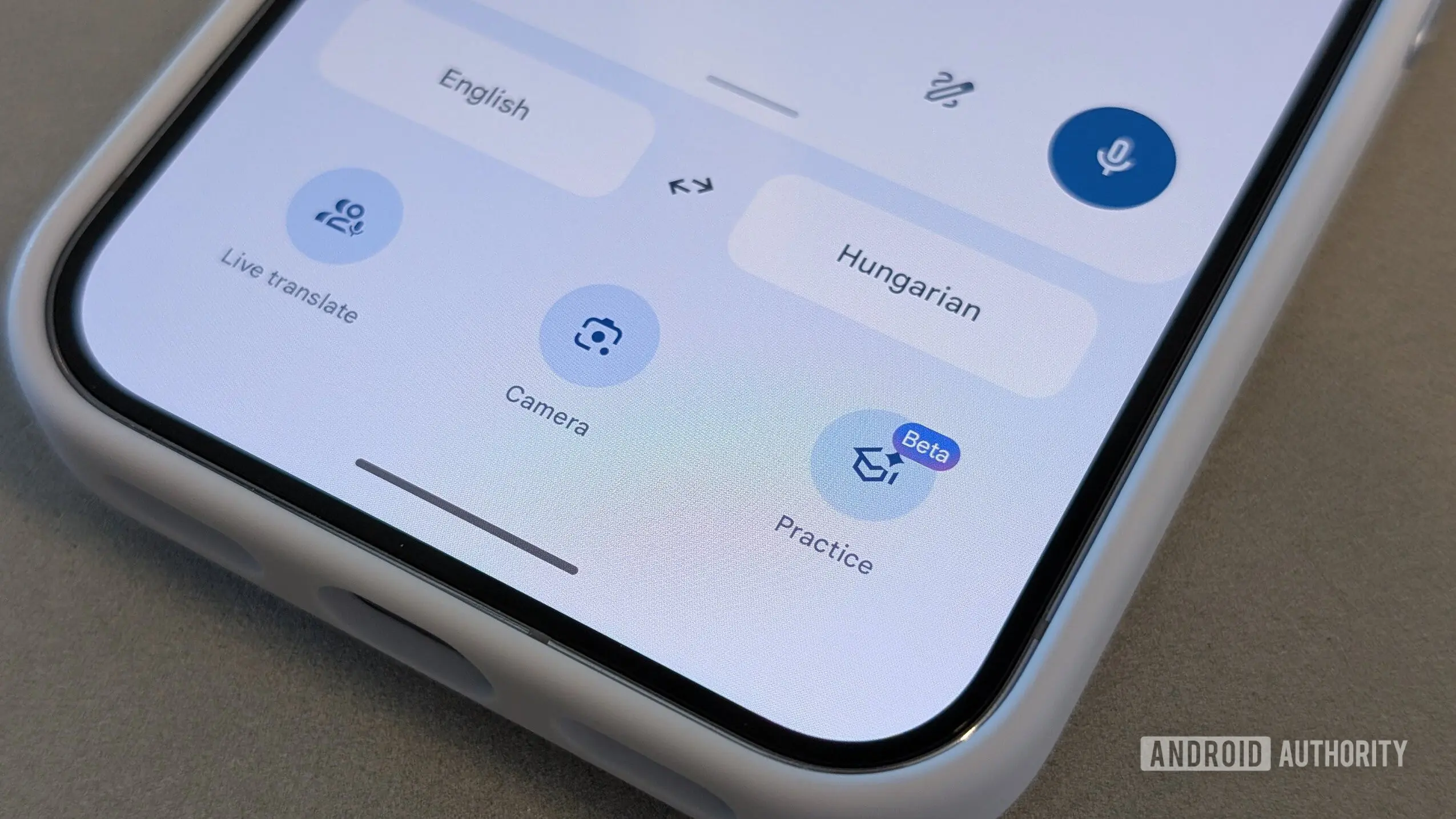
Google Translate has been a cornerstone of Google's productivity suite for over a decade, yet its Android interface has remained largely unchanged while other apps like Gmail, Google Maps, and Google Drive have undergone multiple modernizations. Now, a deep dive into the app's latest version reveals that Google is finally preparing a substantial visual overhaul that brings the translation tool into the present day.
The Context: Why Google Translate Needed a Refresh
Since its launch in 2006 as a web service, Google Translate has evolved from a simple text translator into a multifaceted communication tool. It now supports real-time conversations via the Live feature, visual translation through the camera, and even language practice sessions. However, the app's home screen and navigation have not kept pace with these additions. The current design uses a top-heavy layout with text fields dominating the center, a full-width bottom bar that feels outdated, and scattered access to tools like Saved translations and history. As Google's other Android apps adopted Material Design principles and more intuitive navigation patterns, Translate began to feel like a relic.
What the Leak Reveals: A Cleaner, More Functional Layout
While examining version 10.25 of the Google Translate app for Android, hidden code and unreleased UI elements point to a comprehensive redesign. The most striking change is the introduction of a pill-shaped bottom navigation bar that replaces the old flat bar. This new bar features four distinct sections:
- Translate – the default screen for typing or pasting text translations.
- Live – for entering real-time conversation mode.
- Camera – for translating text captured via the phone's camera.
- Practice – for language learning exercises.
This reorganization mirrors the approach used in Google Maps and YouTube, where the most frequently used tools are placed within easy thumb reach. The pill shape also aligns with Google's recent design language seen in the Pixel Launcher and other system components.
Repositioned Language Selectors and Input Box
Currently, the language selectors (source and target) sit near the middle of the home screen, taking up valuable real estate. In the new design, they have been moved to the top of the interface, freeing up space for the translation results and input area. The translation input box itself has migrated from the center to the bottom of the screen, now appearing as a floating card. This card includes quick access buttons for a three-dot menu, a paste shortcut, and a microphone for voice input—similar to how text input works in Google Messages or Chrome.
Above this input card, contextual suggestions appear. For example, if the user has been practicing a language recently, a card prompts them to continue that session. If they were in a Live conversation, a "Jump back into conversation" shortcut appears, taking them directly back to the Live Translate interface. This contextual intelligence makes the app more proactive and reduces the steps needed to resume previous activities.
Centralized Activity and Settings
One of the most user-friendly changes is the elimination of the standalone Saved shortcut in the top-left corner, replaced by a traditional hamburger menu. Tapping this hamburger icon opens a new "Your activity" screen that consolidates translation history, saved translations, and saved transcripts in one place. Previously, saved transcripts were hidden in the account switcher menu, and history could only be accessed by swiping down on the home screen or through the account menu. This consolidation not only saves time but also reduces confusion, especially for users who frequently revisit past translations. It also aligns with how Google's other apps, like Google Photos and Google Drive, organize user data.
Refined Translation Input and Results Screens
The redesign extends beyond the home screen. When users start typing, the input screen now features a more modern look: the language selectors remain pinned at the top, and the translation area becomes a large rounded card. Recent translations appear directly in the input card while typing, allowing for quick corrections or reuse. This mirrors the behavior seen in Google Keep or Google Docs' suggestion mode.
Similarly, the results page after translation has been overhauled. Instead of displaying source and target texts together in a single view, each now resides in its own card, separated visually. Action buttons have been repositioned, and the language picker stays pinned at the top for easy switching. The top bar has been decluttered: previously, History and Save had dedicated icons. In the new interface, these options, along with Reverse translate, Share, Choose text translation model, and Send feedback, are tucked into a three-dot overflow menu. This minimizes visual clutter while keeping all functionality accessible.
Additional Tools Reorganized
The update also repositions secondary tools. The three-dot menu within the input card now houses the Translation model picker and a Handwriting option. The model picker lets users switch between available translation models—such as the standard neural model or a more specialized one—while handwriting input allows users to write text with a finger or stylus instead of typing. By moving these options to a submenu, the main interface stays clean, but advanced users can still access them with minimal taps.
The Broader Implications
This redesign is significant because it signals Google's commitment to keeping Translate competitive in a market where standalone translation apps like Microsoft Translator and iTranslate have also modernized their interfaces. Moreover, as Google continues to integrate Translate into other services like Gmail and Chrome (via inline translations), a consistent and modern mobile interface will enhance the overall user experience. The redesign also suggests that Google is preparing to introduce more features—such as deeper AI integration or expanded language support—that would benefit from a cleaner, more modular layout.
It is important to note that these changes are still under development. APK teardowns reveal work-in-progress code, and Google may decide to alter or abandon some elements before a public release. However, the presence of extensive new strings and UI resources indicates that the update is in an advanced stage. Historically, similar discoveries from Android Authority's teardowns have often preceded actual rollouts, though timelines can vary from weeks to months.
For users who have grown accustomed to Translate's dated interface, this redesign will be a welcome change. The improved navigation, cleaner typography, and better use of screen space should make day-to-day translations quicker and less frustrating. The emphasis on contextual shortcuts could also make the app smarter over time, learning from user behavior to surface relevant options. As Google Translate continues to add capabilities—such as instant camera translations for 100+ languages and offline mode for critical travel—the interface must evolve to not feel overcrowded. This redesign seems to strike that balance well.
Source: Android Authority News